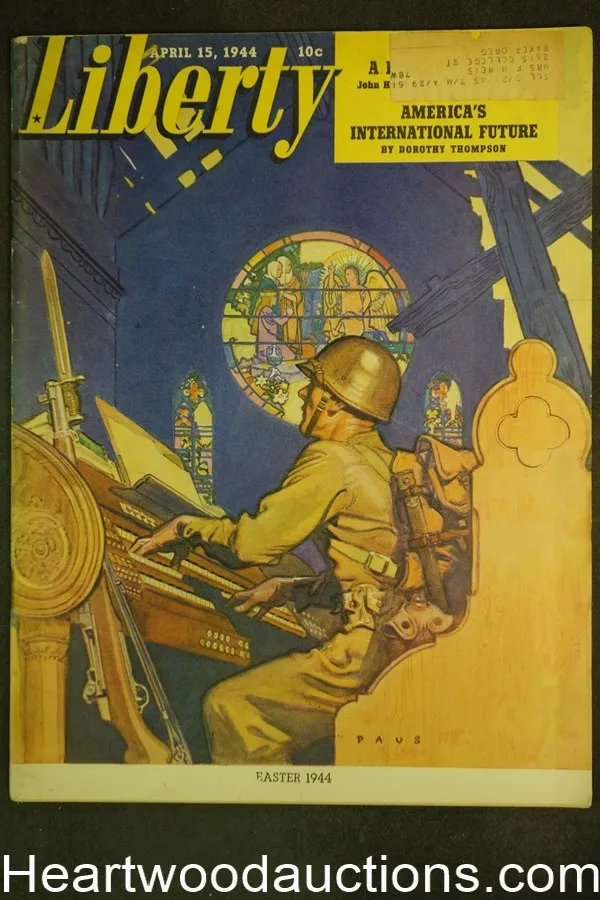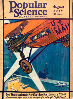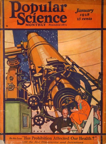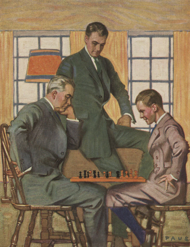
Herbert Andrew Paus, born 1860, was an American illustrator who was inducted into the Society of Illustrators Hall of Fame in 2005. He was particularly associated with the magazine Popular Science, for whom he produced all the covers from mid-1927 to early 1931.
At the age of seven, Herbert was already showing artistic interest and ability. His parents encouraged his artistic talent, sending him for half the day each Saturday to the house of local artist Burt Harwood, where Herbert and several other boys received art lessons. Harwood had studied in Europe and supposdely he was eccentric enough to capture the boy's imaginations. "Every Saturday it was as though the boys had stepped into another world. It was in this secluded, yet invigorating atmosphere that Paus began to thrive artistically." When the Paus family left St. Paul Minnesota for the Puget Sound area of Washington State, Herbert—then eleven years old—continued to study with his mentor, spending three of the next five summer studying with Harwood.

Through the influence of Harwood, at the age of sixteen Paus started a job at the St. Paul Pioneer Press newspaper as a cartoonist. At the time, R.F. Outcault’s comic book character the “Yellow Kid” was forever changing the relationship between newspaper and illustration. The Pioneer Press’s editorial cartoonist left the paper and Paus, who had shown a proclivity toward editorial and humorous drawing, took over as staff cartoonist.
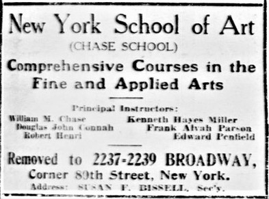
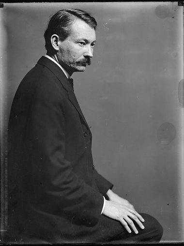
After about two years, however, according to Graphic Arts, Paus “decided that art and journalism were not yet reconciled to each other and joined the Binner Engraving Company of Chicago, which was just discovering commercial illustration.” Shortly after Paus moved to Chicago, later moving to New York when the company expanded. The New York office opened in 1899 with Paus just turning 19. Paus spent his time out of work attending classes at the Chase School of Art under Robert Henri, George Bridgman and F.V. DuMond.
Primarily a watercolourist, Paus used oils on occasion, notably for Hart Shaffner and Marx. He was also expert at pencils and inks. He became a poster and story artist for The Delineator by 1903, followed by commisions for large posters for Bond Bread, The Victor Company, and the US Government in WWI. The United States entrance into World War I brought a pressing need for professionally produced artwork to produce citizenry. The division of Pictorial Publicity shouldered much of the responsibility for choosing and directing the most talented artists. Paus was among the first recruited to lend a hand.
It was mainly his World War I poster designs that attracted the editorial attention of the mainstream press, including the New York Herald. In late December 1919, the Herald published an item on Paus saying, in part: "No mere inspiration of the moment, sudden mood, or flitting fancy, but rather true inspiration, aided by deep study and painstaking execution are responsible for the forceful, effective results that he obtains."

He was committed to doing whatever he could for the war effort. The New York Tribune profile lauds the “willingness and promptness with which he gave his services unrewarded…” Paus created boldly heroic inspirational images that communicated the message effectively.
Through a masterful combination of bright colours, strong composition, and quality technique, the intent in Paus’s poster designs was always clear, urging Americans to join up for service overseas as well as for projects closer to home (such as the Women’s Land Army) , to save money with War Savings Stamps, and to work harder because “Your work is an important factor in the fight for freedom.”
By the end of World War I, Paus was already firmly established in the pantheon of successful American illustrators. Indeed, periodicals aimed at commercial artists and those who commissioned them were already singing Paus’s praises as early as 1912. "He was, above all else, a versatile graphic communicator ready and able to adjust his approach to the sensibilities of the assignment." He made substantial contributions to several aspects of illustration, from delicate watercolours for children’s books to powerful images and striking compositions for posters, and from vibrant art for magazine covers to the creation of comic strips. According to one magazine profile,
“He is extremely adaptable to any age, but is reserved except when in the company of intimate friends, and it takes time to know and appreciate the exceptional merits of this talented and overly modest artist.”
As was the case with many great illustrators of his day, Paus had not only a certain innate ability but also a reliable and strong technique. He was, according to Graphic Arts, a sure and thorough draftsman, with “a fine sense of colour and a maker of absolutely practical advertising pictures in a truly artistic manner.”

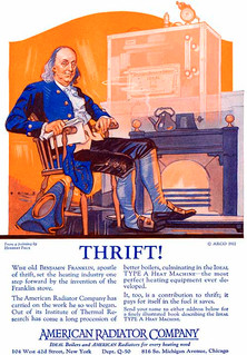
Due to his popularity he was afforded the luxury of choosing assignments that suited him. Paus continued to build his reputation, finding it “conducive to be able to select such commissions as are most interesting and best-suited to his qualifications.” He showed a level of commitment to his advertising work that was in many respects, at the vanguard of the changing look of advertisements—in stark contrast to the adds turned out by the studio. He believed that “as much art belongs in advertising design as in a magazine cover, and he puts it there with the keen graphic touch, appreciation for color, and sense of correct values that are possessions of his and few others.” He received commissions for Willys Overland Cars, American Radiator Company, A & P and Certain-teed.
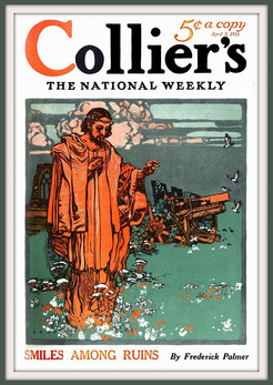
He was also hired to illustrated covers and interiors for Pictorial Review, Collier's, Liberty, Ladies' Home Journal, American Magazine, Life, Woman's Home Companion, Popular Science, Country Life, as well as several books.
Paus would immerse himself in attention to detail, far beyond careful reading of the manuscript. His covers for Popular Science showed that he was well versed enough in the cutting edge of science to provide a viable and artistic representation of scientific advances. His designs became closely associated with Popular Science, and he produced all their covers from mid-1927 to early 1931.

Even during this period, Paus was readily adaptable and far from a slave to the technical constraints associated with the magazine. In the series “Notable American Illustrators,” Walker Engraving Company spotlighted Paus “because his color is as daring as the scale of his monumental figures. (Daring—but beautifully arranged.)” His colours were “daring” to the point of being truly vibrant. Such vivid colours were achieved by his manipulation of traditional media, allowing for a concentration of the pigment that made his colour choices stand out.
Paus wore a visor while working to keep ambient light from diffusing his perception of the colour he had just laid down—and as an aid to keep him focused at the task at hand. For subjects involving single figures, he would usually work directly from life, often posing his wife from whom, according to a story in Redbook in January 1929, “the wearing and draping of clothes amounts to an art.”
A New York Tribune article lists Paus’ hobbies as designing and building furniture in the summer and playing billiards in the winter—activities that require precision, craftsmanship, foresight and patience. Likewise, these characters continually show themselves in Paus’ illustration work.
Herbert Paus died in 1944, aged 84. "Over 50 years after his death, the broad imaginative appeal of Paus’ artwork remains are fresh to the eye today."
Reading Recommendations & Content Considerations

The Art of Herbert Paus


